The celebrated nurse improved public health through her groundbreaking use of graphic storytelling.
By RJ Andrews
Excerpt:
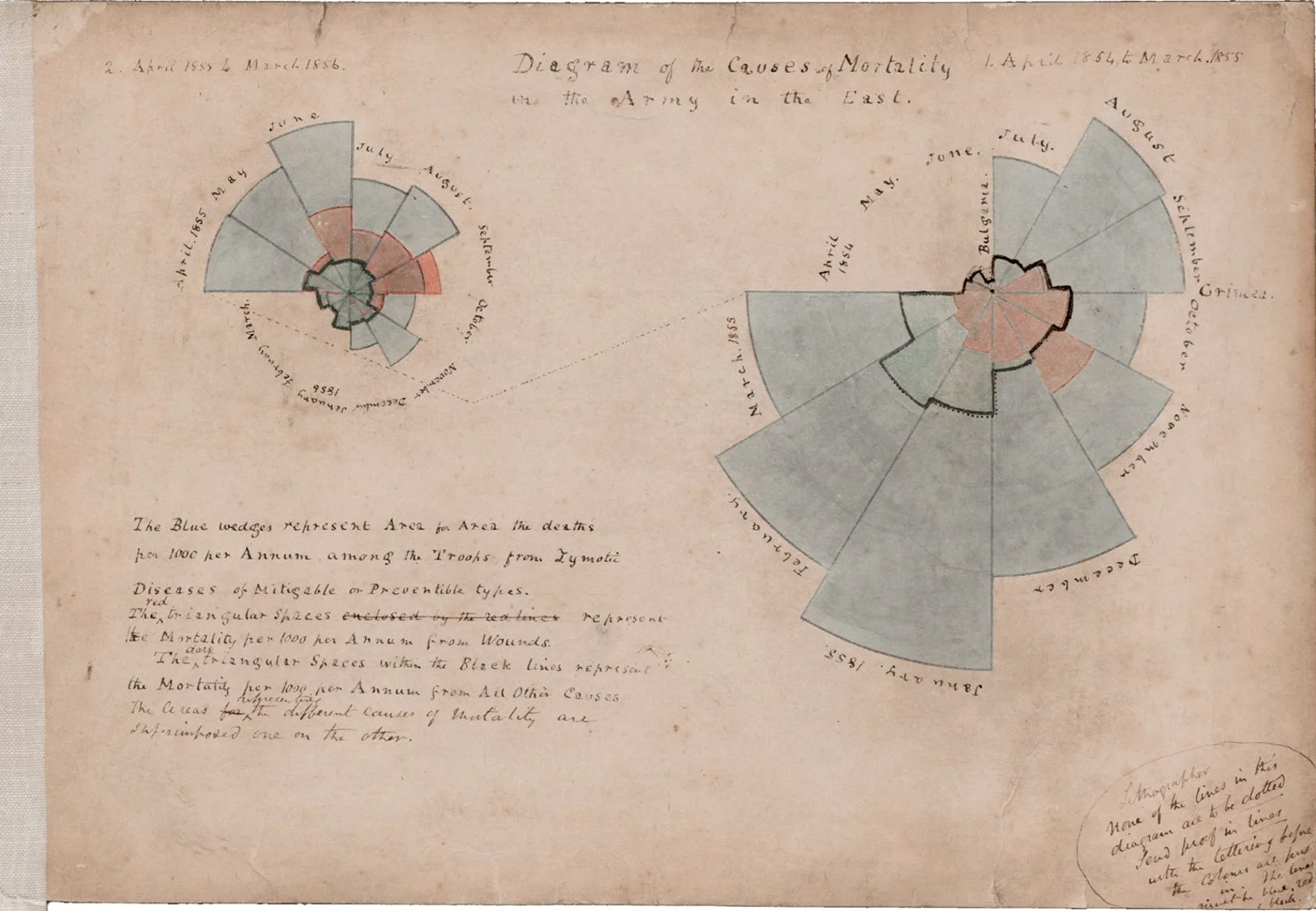
Nightingale’s key persuasion tactic was to convey statistics in exciting ways. I recently conducted the first in-depth study of how Nightingale created and used data visualization, and I share my research in the forthcoming book Florence Nightingale, Mortality and Health Diagrams (Visionary Press). I studied correspondence that details Nightingale’s information-design process, hand-drawn draft diagrams never before seen by the public and a complete catalog of her information graphics. We can now appreciate better than ever what an innovator Nightingale was and how her techniques foreshadowed how data graphics would become essential to public understanding and debate today.
Recognizing that few people actually read statistical tables, Nightingale and her team designed graphics to attract attention and engage readers in ways that other media could not. Their diagram designs evolved over two batches of publications, giving them opportunities to react to the efforts of other parties also jockeying for influence. These competitors buried stuffy graphic analysis inside thick books. In contrast, Nightingale packaged her charts in attractive slim folios, integrating diagrams with witty prose. Her charts were accessible and punchy. Instead of building complex arguments that required heavy work from the audience, she focused her narrative lens on specific claims. It was more than data visualization—it was data storytelling.