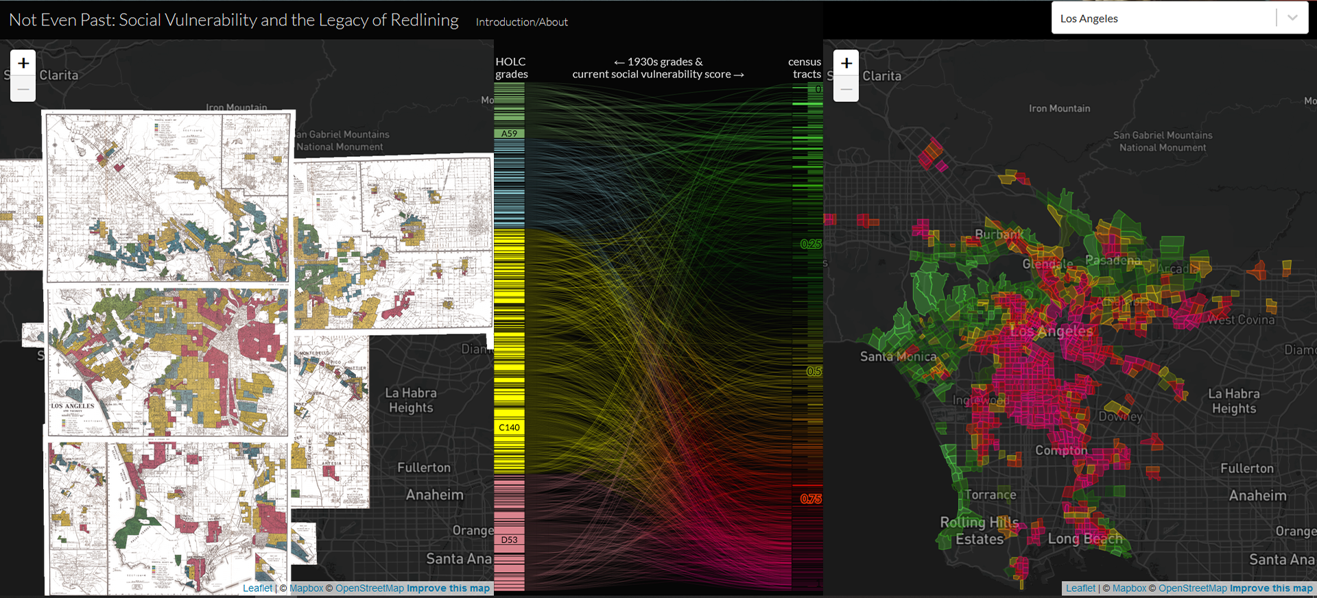
 Not Even Past: Social Vulnerability and the Legacy of Redlining visually documents formal and informal systemic practices of racial residential segregation in the U.S. during the twentieth century. Not Even Past presents maps for 200 cities, where for each city there are two maps side by side separated by a diagram. The left map shows data from 1930’s HOLC (Home Owners’ Loan Corporation) grades and the right map shows the Center for Disease Control’s Social Vulnerability Index (SVI) scores for census tracts today. The redlining data for the 1930s is taken from Mapping Inequality: Redlining in New Deal America. The current social vulnerability score taken from U.S. Census’s American Community Survey 2018 Data Release. The diagram shows paths between them, connecting the same areas across time to show impact of redlining – whether they have changed or stayed the same.
To enter the project, select a city from the project list.
via NPR